Normally I’d be continuing my ongoing series on the evolutionary history of the human brain. However, there is yet another red meat scare story making the rounds—and many readers have asked me to analyze it. Should we really be eating less red meat?
I don’t like to spend my time debunking specific studies—because as I said in a previous article about bad science, it’s like trying to hold back the ocean with a blue tarp and some rebar. However, I’ve wanted to write an article about the limitations and potential abuses of observational studies for some time, and “Red Meat Consumption And Mortality” is as good a starting point as any.
What Kind Of Study Is This, Anyway? Randomized Controlled Trials Vs. Observational Studies
The first and most important question we must ask is “What actual scientific data is this article based on?” It’s often tricky to find out, because most “news” articles don’t even mention the title of the original scientific paper, let alone link to it. (I usually start with a Pubmed search on the authors and narrow it down by journal.) In the overwhelming majority of cases, we’ll find that the data in question comes from what’s known as a “retrospective cohort study”.
In some cases, there isn’t any data: it’s just a lightly-camouflaged press release from a supplement peddler or drug manufacturer, designed to sell you pills, powders, or extracts. We’ll ignore those for now.
When most of us think of a scientific study, we’re thinking of a randomized controlled trial (RCT). The participants are divided randomly into two groups, matched as well as possible for age, sex, health history, smoking status, and any other factor that might affect the outcome. One group is given the treatment, the other is given no treatment.
In the more rigorous forms of RCT, the “no treatment” group is given a sham treatment (known as “placebo”) so that the subjects don’t know whether they’ve received treatment or not. This is sometimes called a “single-blinded” trial. Since the simple act of being attended to has a positive and significant effect on health (the “placebo effect”), unblinded trials (also known as “open label”) are usually not taken very seriously.
To add additional rigor, some trials are structured so that the clinicians administering the treatment don’t know who’s receiving the real treatment or not. This is sometimes called a “double-blinded” trial. And if the clinicians assessing outcomes don’t know who received the real treatment, it’s sometimes called “triple-blinded”. (These terms are now being discouraged in favor of simply calling a study “blinded” and specifying which groups have been blinded.)
Double-blinded, randomized controlled trials are the gold standard of research, because they’re the only type of trial that can prove the statement “X causes Y”. Unfortunately, RCTs are expensive—especially nutrition studies, which require feeding large groups over extended periods, and to be completely rigorous, isolating the subjects so they can’t consume foods that aren’t part of the experiment. (These are usually called “metabolic ward studies”.)
Result: RCTs are infrequently done, especially in the nutrition field.
What Is An Observational Study? Cohort Studies and Cross-Sectional Studies
Since nutrition RCTs are so rare, almost all nutrition headlines are based on observational studies.
In an observational study, the investigators don’t attempt to control the behavior of the subjects: they simply collect data about what the subjects are doing on their own. There are two main types of observational studies: cohort studies identify a specific group and track it over a period of time, whereas population studies measure characteristics of an entire population at one single point in time.
Cohort studies can be further divided into prospective cohort studies, in which the groups and study criteria are defined before the study begins, and retrospective cohort studies, in which existing data is “mined” after the fact for possible associations. (More.)
As the terminology starts getting intense (e.g. case-control studies vs. nested case-control studies), I’ll stop here.
The overwhelming majority of nutrition headlines are from cohort studies, in which health data has been collected for years (or decades) from a fixed group of people, often with no specific goal in mind. Expressed in the simplest possible language:
“Let’s watch the same group of people for decades, measure some things every once in a while, and see what happens to them. Then we can go back through the data and see if the people with a specific health issue had anything else in common.”
It’s easy to see that looking for statistical associations in data that already exists is far easier and cheaper than performing a randomized clinical trial. Unfortunately, there are several problems with observational studies. The first, and most damning, is that observational studies cannot prove that anything is the cause of anything else! They can only show an association between two or more factors—
—and that association may not mean what we think it means. In fact, it may not mean anything at all!
There are more potential pitfalls of the retrospective observational studies which underlie almost every nutrition headline. Let’s explore some of them.
Problem: Sampling Bias
Here’s the classic example of sampling bias:

Going into the 1948 presidential election, polls consistently predicted a Dewey victory, by a substantial margin of 5-15%. Of course, Harry S Truman won by 4.4%. The reason the poll results differed so much from the actual outcome was that the polling was done by telephone—and in 1948, private telephone lines were very expensive. Therefore, the pollsters were unwittingly selecting only the relatively wealthy—who tended to vote Republican—for their survey. (More: DEWEY DEFEATS TRUMAN and Cancer Statistics, J Natl Cancer Inst (2009) 101 (16): 1157.)
In other words, the entire group we’re studying may have inadvertently been selected for certain characteristics that skew our results, making them inapplicable to the population at large.
Selection Bias, or The Healthy Volunteer Problem
“Selection bias” occurs because, unlike an RCT in which the participants are randomly assigned to groups that are matched as well as possible, the people in an observational study choose their own behavior.
Most women will be familiar with the classic story of selection bias: the saga of hormone replacement therapy, or HRT.
1991: “Every woman should get on HRT immediately, because it prevents heart attacks!”
2002: “Every woman should get off HRT immediately, because it causes heart attacks!”
What happened?
Int. J. Epidemiol. (2004) 33 (3): 464-467.
The hormone replacement–coronary heart disease conundrum: is this the death of observational epidemiology?
Debbie A Lawlor, George Davey Smith and Shah Ebrahim
“…the pooled estimate of effect from the best quality observational studies (internally controlled prospective and angiographic studies) inferred a relative reduction of 50% with ever [sic] use of HRT and stated that ‘overall, the bulk of the evidence strongly supports a protective effect of estrogens that is unlikely to be explained by confounding factors’.4
By contrast, recent randomized trials among both women with established CHD and healthy women have found HRT to be associated with slightly increased risk of CHD or null effects.1,2 For example, the large Women’s Health Initiative (WHI) randomized trial found that the hazards ratio for CHD associated with being allocated to combined HRT was 1.29 (95% CI: 1.02, 1.63), after 5.2 years of follow-up.1″
How did a 50% reduction in CHD (coronary heart disease) turn into a 30% increase in CHD?
It’s because the initial data from 1991 was from the Nurses’ Health Study, an associative cohort study which could only answer the question “What are the health characteristics of nurses who choose to undergo HRT versus nurses who don’t?” The followup data from 2002 was from a randomized clinical trial, which answered the much more relevant question “What happens to two matched groups of women when one undergoes HRT and the other doesn’t?”
It turns out that the effect of selection bias—women voluntarily choosing to be early adopters of a then-experimental procedure—completely overwhelmed the actual health effects of HRT. In other words, nurses who were willing to undergo cutting-edge medical treatment were far healthier than nurses who weren’t.
Is The Data Any Good? Garbage In = Garbage Out
This huge pitfall of observational studies is often neglected: in large cohort studies, data is often self-reported, and self-reported data is often wildly inaccurate.
Since we’re already discussing the Nurses’ Health Study, let’s take a closer look at its food consumption data. This study attempted to rigorously evaluate the accuracy of the FFQs (Food Frequency Questionaire) filled out by study participants:
Int J Epidemiol. 1989 Dec;18(4):858-67.
Food-based validation of a dietary questionnaire: the effects of week-to-week variation in food consumption.
Salvini S, Hunter DJ, Sampson L, Stampfer MJ, Colditz GA, Rosner B, Willett WC.
“The reproducibility and validity of responses for 55 specific foods and beverages on a self-administered food frequency questionnaire were evaluated. One hundred and seventy three women from the Nurses’ Health Study completed the questionnaire twice approximately 12 months apart and also recorded their food consumption for seven consecutive days, four times during the one-year interval.”
In other words, the standard FFQ for the Nurses’ Health Study consists of “Try to remember what you ate last year, on average.” We might expect this not to be terribly accurate…
…and we’d be right.
“They found that the FFQ predicted true intake of some foods very well and true intake of other foods very poorly. True intake of coffee could explain 55 percent of the variation in answers on the FFQ, while true intake of beer could explain almost 70 percent. True intake of skim milk and butter both explained about 45 percent, while eggs followed closely behind at 41 percent.
But the ability of the FFQ to predict true intake of meats was horrible. It was only 19 percent for bacon, 14 percent for skinless chicken, 12 percent for fish and meat, 11 percent for processed meats, 5 percent for chicken with skin, 4 percent for hot dogs, and 1.4 percent for hamburgers.
If your jaw just dropped, let me assure you that you read that right and it is not a typo. The true intake of hamburgers explained only 1.4 percent of the variation in people’s claims on the FFQ about how often they ate hamburgers!”
–“Will Eating Meat Make Us Die Younger?”, Chris Masterjohn, March 27, 2009
Stop for a moment and wrap your mind around this fact: the intake of meat reported by the hundreds of studies which use data mined from the Nurses’ Health Study is almost completely unrelated to how much meat the study participants actually ate.
Here’s a graph of the ugly truth, again from Chris Masterjohn:
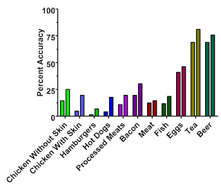
The left-hand bars are the first questionaire, which we'd expect to be closer to the reported data in the NHS than the second questionaire (right-hand bars).
Why might this be the case?
“Focusing on the second questionnaire, we found that butter, whole milk, eggs, processed meat, and cold breakfast cereal were underestimated by 10 to 30% on the questionnaire. In contrast, a number of fruits and vegetables, yoghurt and fish were overestimated by at least 50%. These findings for specific foods suggest that participants over-reported consumption of foods often considered desirable or healthy, such as fruit and vegetables, and underestimated foods considered less desirable.” –Salvini et.al., via Chris Masterjohn
In support, I note that reported intake of yellow squash and spinach was also correlated by less than 10% with actual intake. Additionally, I’ll point you towards this article, which begins with a startling statistic: 64% of self-reported ‘vegetarians’ in the USA ate meat on at least one of the two days on which their dietary intake was surveyed.
In other words, the observational studies that cite meat intake data from the Nurses’ Health Study are not telling you about the health of nurses who actually eat meat: they’re telling you about the health of nurses who are willing to admit to eating meat on a written questionaire—and the two are almost completely unrelated. Furthermore, I see no basis to claim that any other data set based on occasional self-reported dietary intake will be substantially more accurate.
Thanks again to Chris Masterjohn for his work: “Will Eating Meat Make Us Die Younger?” and the classic “New Study Shows that Lying About Your Hamburger Intake Prevents Disease and Death When You Eat a Low-Carb Diet High in Carbohydrates.”
“Correlation Does Not Imply Causation”: What Does That Mean?
The logical fallacy of “correlation proves causation” is extremely common—because it’s very easy to slide into.
It’s called “cum hoc ergo propter hoc” in Latin, if you want to impress people at the risk of being pedantic. Literally translated, it means “with this, therefore because of this.”
You can entertain yourself for hours with this long list of logical fallacies, both formal and informal.
In plain language, “correlation does not imply causation” means “Just because two things vary in a similar way over time doesn’t mean one is causing the other.” Since observational studies can only prove correlation, not causation, almost every nutrition article which claims “X Causes Y” is factually wrong. The only statements we can make from an observational study are “X Associated With Y” or “X Linked With Y”.
We’ve already covered the cases in which sampling bias and selection bias skew the results, and the cases in which the data is inaccurate: let’s look at the purely logical pitfalls.
First, we could be dealing with a case of reverse causation. (“I always see lots of firemen at fires: therefore, firemen cause fires and we should outlaw firemen.”)
Second, we could be dealing with a third factor. “Sleeping with one’s shoes on is strongly correlated with waking up with a headache. Therefore, sleeping with one’s shoes on causes headaches.” Obviously, in this case, being drunk causes both…but when we’re looking at huge associative data sets and trying to learn more about diseases we don’t understand, the truth isn’t so obvious.
The third factor is often one of the pitfalls we’ve previously discussed: sampling bias, selection bias, or inaccurate data. Another example of selection bias: “Playing basketball is strongly correlated with being tall. Therefore, everyone should play basketball so they grow taller.” (Hat tip to Tom Naughton for the analogy.)
Or, the relationship could be a spurious relationship—pure coincidence.


Personally, I blame M. Night Shyamalan.
Complete Bunk: It Happens
There is also the possibility that the truth is being stretched or broken…that the data is being misrepresented. This isn’t as common with peer-reviewed science as it is with books and popular media (see Denise Minger’s debunking of “The China Study” and “Forks Over Knives”), but it can and has occurred.
“Red Meat Blamed For 1 In 10 Early Deaths”: Where’s The Science?
Now that we understand the limitations and potential pitfalls of observational studies, we can rationally evaluate the claims of the news articles based on them. For example, here’s the actual study on which the latest round of “Red Meat Will Kill You” stories is based:
Arch Intern Med. doi:10.1001/archinternmed.2011.2287
Red Meat Consumption and Mortality: Results From 2 Prospective Cohort Studies
An Pan, PhD; Qi Sun, MD, ScD; Adam M. Bernstein, MD, ScD; Matthias B. Schulze, DrPH; JoAnn E. Manson, MD, DrPH; Meir J. Stampfer, MD, DrPH; Walter C. Willett, MD, DrPH; Frank B. Hu, MD, PhD
“Prospective cohort study?” Apparently this is yet another observational study—and therefore, it cannot be used to prove anything or claim that anything “causes” anything else. Correlation is not causation.
Unfortunately, while the study authors maintain this distinction, it’s quickly lost when it comes time to write newspaper articles. Here’s a typical representative:
Headline: “Red meat is blamed for one in 10 early deaths” (The Daily Telegraph)
[False. Since Pan et.al. is an observational study, we can’t assign blame.]
“Eating steak increases the risk of early death by 12%.”
[Another false statement: associational studies cannot prove causation.]
“The study found that cutting the amount of red meat in peoples’ diets to 1.5 ounces (42 grams) a day, equivalent to one large steak a week, could prevent almost one in 10 early deaths in men and one in 13 in women.”
[Note the weasel words “could prevent”. Just like playing basketball could make you taller, but it won’t. And just like HRT could have prevented heart attacks: instead, it caused them.]
“Replacing red meat with poultry, fish or vegetables, whole grains and other healthy foods cut the risk of dying by up to one fifth, the study found.”
[No, it didn’t. The risk of dying was associated with self-reported intake of red meat and “healthy foods”.]
“But that’s just definitional nitpicking,” you say. “What about that 12% association?” It’s not nitpicking at all—because we’ve just opened the door to explaining that association in many other ways.
What Does “Red Meat Consumption and Mortality” (Pan et.al.) Really Tell Us?
“We prospectively observed 37 698 men from the Health Professionals Follow-up Study (1986-2008) and 83 644 women from the Nurses’ Health Study (1980-2008) who were free of cardiovascular disease (CVD) and cancer at baseline. Diet was assessed by validated food frequency questionnaires and updated every 4 years.”
–Pan et.al.
Remember the Nurses’ Health Study?
The same study we talked about above—which was used to claim that HRT decreased heart disease by 50%, while a controlled trial showed that HRT actually increased heart disease by 30%?
The same study we talked about above—for which we’ve already proven, using peer-reviewed research, that the self-reported meat consumption data from the “food frequency questionaires” was unrelated to how much meat the nurses actually ate? And that the nurses, like most of us, exaggerated their intake of foods they thought were healthy by over 50%, and decreased their intake of foods they thought were unhealthy (like red meat) by up to 30%?
Yes, we’ve just kicked the legs out from under this entire study. It’s pinning a 12% variation in death rate on data we’ve already proven to be off by -30% to +50%—and more importantly, to be unrelated to the nurses’ actual consumption of red meat. (Or of meat in general…even chicken was only recalled with 5-14% accuracy.)
So much for the headlines! Here’s an accurate statement, based on the actual data from Pan et.al.:
“If you are a nurse or other health professional, telling the truth about how much red meat you eat, on a survey you fill out once every four years, is associated with a 12% increased risk of early death.”
And just to nail this down, here’s another study—also from the Harvard School Of Public Health—which comes to the opposite conclusion:
Circulation. 2010 Jun 1;121(21):2271-83. Epub 2010 May 17.
Red and processed meat consumption and risk of incident coronary heart disease, stroke, and diabetes mellitus: a systematic review and meta-analysis.
Micha R, Wallace SK, Mozaffarian D.
Department of Epidemiology, Harvard School of Public Health, Boston, MA, USA.
Red meat intake was not associated with CHD (n=4 studies; relative risk per 100-g serving per day=1.00; 95% confidence interval, 0.81 to 1.23; P for heterogeneity=0.36) or diabetes mellitus (n=5; relative risk=1.16; 95% confidence interval, 0.92 to 1.46;
But Wait, There’s More
We’re done, and I could easily stop here—but there’s more to talk about! Note this surprising statement from the “Results” section:
“Additional adjustment for saturated fat and cholesterol moderately attenuated the association between red meat intake and risk of CVD death, and the pooled HR (95% CI) dropped from 1.16 (1.12-1.20) to 1.12 (1.07-1.18).”
–Pan et.al. (Credit to “wildwabbit” at Paleohacks for catching this one.)
And the data from Table 1 clearly shows that the people who admitted to eating the most red meat had, by far, the lowest cholesterol levels.
Wait, what? Aren’t saturated fat and cholesterol supposed to cause heart disease? This is another clue that the story, and the data, isn’t quite as advertised.
Here’s another trick that’s been played with the data: contrary to the statement “replacing 1 serving of total red meat with 1 serving of fish, poultry, nuts, legumes, low-fat dairy products, or whole grains daily was associated with a lower risk of total mortality”, the curve they draw in Figure 1 has been dramatically, er, “smoothed.” The source data, in Table 2, shows that the age-adjusted quintiles of reported unprocessed red meat intake from the Nurses’ Health Study (remember, we’ve already proven these numbers aren’t real) have hazard ratios of 1.00, 1.05, 0.98, 1.09, and 1.48.
In other words, the data isn’t a smooth curve…it’s a hockey stick, and the relative risk is basically 1.0 except for the top quintile. (Credit to Roger C at Paleohacks for catching this one.)
This is important because it helps us to explain the 12% increase based on reported red meat consumption. We already know that the subjects of the study weren’t truthfully reporting their meat intake of any kind—and that foods perceived unhealthy were underreported on average, while foods reported healthy were overreported on average.
Table 1 shows that the highest quintile of reported red meat consumption was strongly associated with other behaviors and characteristics known to be associated with poor health: smoking, drinking, high BMI. Most impressively, it was associated with a 69% increase (NHS data) or 44% increase (HPF data) in reported total calories per day, which lends weight to the idea that the lower quintiles were simply underreporting their intake of foods they considered “unhealthy”, including red meat…
…unless we accept that 1/5 of nurses live on 1200 calories per day (and coincidentally report the lowest red meat intake) while 1/5 eat over 2000 calories per day (and coincidentally report the highest red meat intake).
Calorie consumption is our smoking gun. The average American female aged 20-59 consumes approximately 1900 calories/day, and not all nurses are female. (Source: NHANES 1999-2000, through the CDC.)
Therefore, a reported average consumption of 1200 calories/day is extremely implausible. It’s even less plausible that nurses who reported the lowest intake of red meat just happened to be on a 1200-calorie semi-starvation diet; that total reported calorie intake just happened to rise dramatically with reported red meat intake; and that only the nurses who reported eating the most red meat consumed a statistically average number of total calories.
Since we already know from Salvini et.al. that actual consumption is unrelated to reported consumption, underreporting of red meat and other foods perceived as “unhealthy” by the lower quintiles is a far more reasonable explanation.
So What’s The Real Story?
While we’ll probably never know the truth, I believe the most parsimonious explanation is this:
Nurses and other health professionals know intimately the mainstream advice on health, and cannot fail to have given it to thousands of patients over the decades: “eat less, stop smoking, drink less alcohol, avoid cholesterol, avoid saturated fat, avoid red meat.” Therefore, any health professional willing to admit in writing to smoking, drinking, and eating over three servings of red meat per day (see the NHS data in Table 1) most likely doesn’t care very much about their own state of health.
And just as we saw with the HRT data—where a theoretical 50% decrease in heart disease was later proven to mask a real 30% increase, due to the selection bias inherent in the very same dataset (Nurses’ Health Study) used here—I think that we’ll someday find out through controlled, randomized trials that eating plenty of red meat, eggs, and other whole, natural foods high in cholesterol and saturated fat is the real “heart-healthy diet.”
Live in freedom, live in beauty.
JS
Welcome Daily Crux readers! If you enjoyed this article, you might want to sign up for my RSS feed or my mostly-weekly newsletter. You can also bookmark the index to my previous articles, organized by topic.
What an epic this turned out to be! Please use the buttons below to forward this article around, and please send this link to anyone who sends you one of the innumerable scare stories. And if you learn of other solid debunking articles I can link, contact me or leave a comment!
You can support my continued efforts to bring you these dense, informative articles by buying a copy of my “Bold, fresh and interesting,” “Elegantly terse,” “Scathing yet beautiful,” “Funny, provocative, entertaining, fun, insightful” book, The Gnoll Credo—or even a T-shirt.


")


